
NEW Toyota Prius hybrid presentation 2023
Is a brand-new redesign Toyota Prius hybrid. And this is a Japanese version, but the US version is gonna look the same and maybe have some differences under the hood.
In this article, I want to talk about this design because it’s one heck of an improvement that comes to styling, but its performance, which the old one lack.
What we’re going to do in this article “Toyota Prius hybrid 2023” is have a look at the front side, rear, and interior. And then I’m going to show you the Mondelista style.
That’s the in-house tuning of Toyota. They have already dropped two different versions of the new Toyota Prius hybrid which I think looks even better than the standard version.
New Features
So the hybrid system in the new fifth-generation Toyota Prius hybrid delivers 193 HP in standard form and 220 HP in the plug-in hybrid variant, making it much more potent than the previous model, which only had a combined power output of 121.
Eight-liter gas inline four has been replaced by a two-liter unit. The specs for the US model will be dropped tonight and maybe a little bit different from the Japanese model.
However, the design will most likely stay the same. And that’s what we’re focusing on here. I never thought I’d say this, but I didn’t think Toyota would ever design a good-looking Toyota Prius hybrid.
This one is longer, wider, and lower than its predecessor, making it more planted and look a lot sportier.
It feels unified in its alignment and surfaces and less weak. It’s simplified, solid, and of course, a lot sportier.
Not only is this a huge improvement on the exterior, the interior feels a lot more modern as well.
Show you that it even has a proper gauge cluster now. And it will go on sale in the US in early 2023, with a starting price of around 26000$.
So many times with a lot of different manufacturers these days that 90% of the manufacturers are going back to a simplified design.
We talked about this. When it comes to Honda, Toyota Prius hybrid is doing the same.
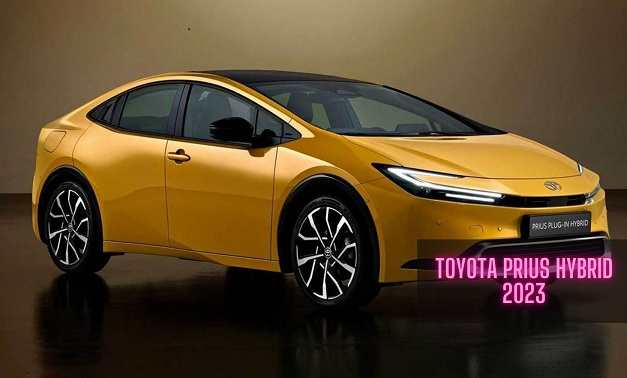
So let’s have a look at the front-end graphics here and compare them to the new one the old one had. You see the headlights here.
For example- stretching up to this point right here, and then being a separate graphic unit, a graphic element in the front end.
We also have this opening in the front end, which looks like almost whiskers or something like that.
None of these elements feel like they have any connection to each other. And it makes it look weak.
If you have a solid piece of, let’s say, aluminum, and you cut it, you make cuts in it in random places, it’s going to make the solid block of aluminum, it’s going to make it look weaker.
I think that’s exactly what happened here. There are too many lines going on and too much over-styling.
Why does that need to be separate from the headlights?
Let’s combine these two elements into one single graphic, and looks cleaner than it did in the previous generation.
Same thing with the lower part
They combined the side intake right here with the intake that we have in the middle and combined it into one graphic. And then you have similar styling in these two graphic features, the top half and the lower half connecting.
It looks a whole lot better than the previous generation. It looks more solid, and more unified, in my opinion.
Now, looking at it from an aside, I think this is the biggest change when it comes to the new Toyota Prius hybrid.
For example- The old one looks pretty bubbly, but it still has a decent hatchback style and not too much of an EV bubble. The reason for that is to look at how much mass sits over this small rear tire. And then you have the roofline of the greenhouse being cut right here.
That is another one of these cuts that I’m talking about, cutting away the graphics and making it less structural and weaker. And they don’t connect to anything in the rest of the body.
So chamfers and cuts in a body that doesn’t make sense. And I want to show you this. The new Toyota Prius hybrid has a super steep rake to the greenhouse. It looks a little more bubbly, a little more Elvish.
Look for a car over the more normal traditional hashtags design that we have in the previous generation Toyota Prius hybrid up here.
We have one sharp line that fades into the shoulder line right here. Nothing going on right here.
Unless we want to have some line flow in the car, which they decided not to go with, that means that we don’t need to add excessive styling and lines in the body if it’s not going to lead anywhere.
We don’t have this lifted rear end and a small bumper and then a massive graphic height of this piece right here.
That builds and looks pretty unstable because it rests on such a small bumper. What they did in the new one was increase the height of the bumper.
As you can see, they smoothed it out and then created brand-new graphics for the tail light.
It reminds me a little bit of the Sony Vision S, I think it’s called. The Sony concept that they unveil, a couple of years ago at CES.
The front end reminds me of a little inspired by the SF 90 style with these wings going into the headlights, which is not a bad thing.
You can also see in the rear end that they simplify these graphics. I never understood this styling of the tail light of the previous iteration to be so random and all over the place.
You can see how much cleaner it is by having a nice clean light bar in the rear end. The trend of the decade right there coming back in the new Toyota Prius hybrid.
Looking at the interior, as you know, we had this interesting integration of a gauge cluster in the previous generation Prius, which is not bad at all, still looks starting to look a little dated with these materials.
High glossy plastic and the steering wheel look dated. Over-styling seems to be the theme of the previous generation Toyota Prius hybrid.
They simplified it a lot again. And this looks so much more modern. We don’t have a lot of glossy plastic all over the place.
We now have this horizontal treatment, which is a trend when it comes to the interior.
Here you can see we still have almost this waterfall design. Now it seems everybody is moving towards this integration where we have a horizontal line cutting through the whole interior.
I think this looks so much better than the previous generation as well. And we have the gauge cluster which used to sit right here and has now been moved into this position, which reminds me of the Toyota BZ four X has a similar design to the interior.
BMW and Mercedes have just a screen behind the steering wheels. I want to show you the model listed by the in-house styling team of Toyota that released two different variants for the new Prius already.
So you have the elegant Ice style right here, which has a new front bumper, a new side skirt, and also some changes to the rear, as you can see here, making it a bit sportier than the standard one.
The new advanced style where you have some new LEDs even in the lower part down here.
Not sure if these are going to break by some stone chips or something like that because they sit so low, but they look cool, and they look a lot more sporty than the standard version.
You also have another rear end, some additions to the side skirts, and the lower part of the bumper in the rear as well to make it look closer to the ground and also add more sportiness to this design.
Let me know what you think about the new Toyota Prius hybrid. Do you prefer the previous generation, or do you like this new approach where simplified design seems key point?
Related Post